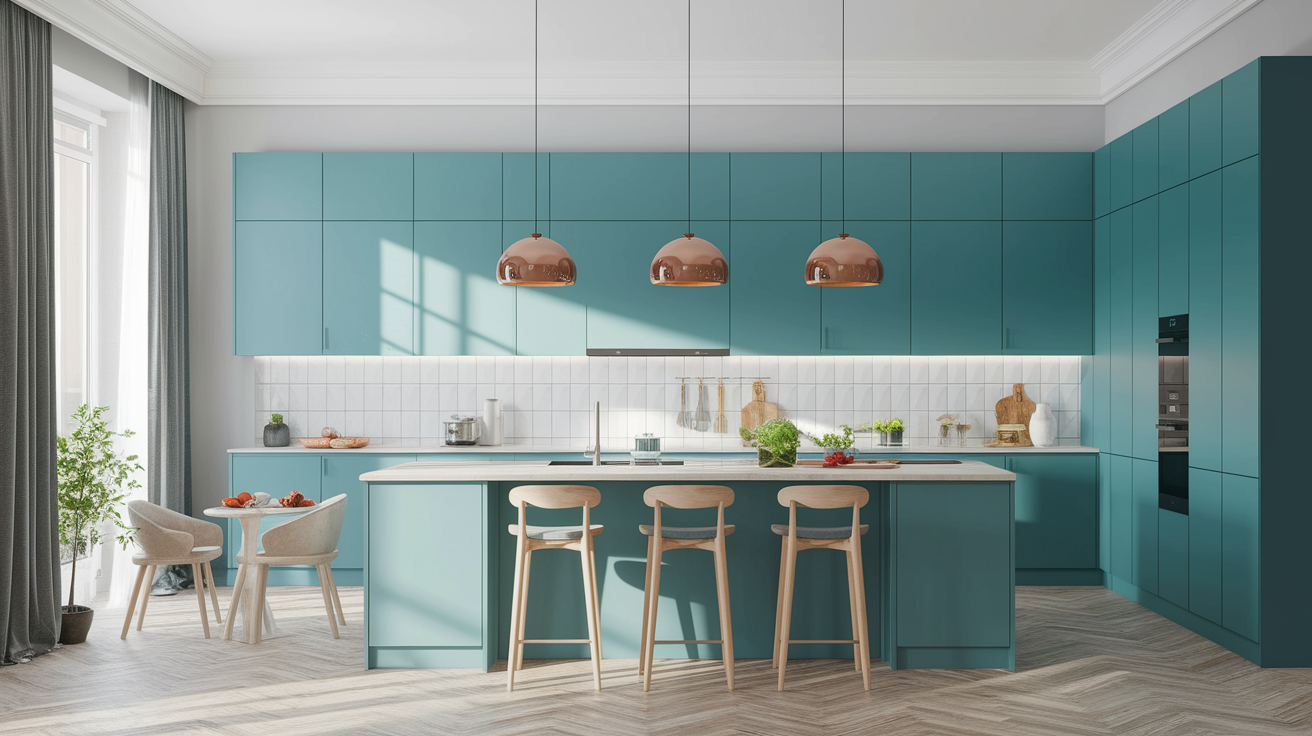
Your kitchen deserves better than builder-grade white cabinets and safe beige walls.
I’ve watched the kitchen color revolution unfold over the past year, and 2026 is shaping up to be the most exciting time to embrace color in this hardworking space.
Designers are ditching the all-white aesthetic that dominated for the last decade and diving headfirst into rich, atmospheric hues that make kitchens feel like actual rooms—not sterile showrooms.
Here’s what makes this moment different: these aren’t trendy colors that’ll look dated in three years. We’re talking about sophisticated, timeless combinations that add warmth and soul while still feeling completely modern. The best part? You don’t need a complete renovation to transform your kitchen. Strategic color choices on cabinets, walls, or even just hardware can completely shift the energy of your space.
I’m sharing 27 color combinations that designers are obsessing over right now—from warm neutrals that feel grounded and inviting to unexpected greens and blues that bring personality without overwhelming your space. Whether you’re planning a full kitchen refresh or just want to update a few elements, you’ll find actionable ideas that work for every style and budget.
Ready to discover the color combination that’ll make you smile every time you walk into your kitchen? Let’s dive in.
The Ultimate Guide to Warm Neutral Kitchen Color Combinations
Warm neutrals are having their moment, and for good reason. These aren’t the boring beiges of the past—we’re talking about rich, dimensional colors that create depth and atmosphere while staying incredibly livable.
Mushroom & Warm Walnut
Deep mushroom tones deliver boldness without the commitment anxiety that comes with bright colors. This sophisticated neutral sits somewhere between taupe and gray, offering enough color to make a statement while remaining versatile enough to work with virtually any design style.
Pair mushroom-colored cabinets with warm walnut wood accents, and you’ve created a kitchen that feels both contemporary and timeless. The combination works beautifully because the cool undertones in mushroom balance perfectly with walnut’s warm, honey-like grain. Try mushroom on lower cabinets with walnut open shelving above, or go all-in with mushroom cabinetry throughout and add walnut through your island, floating shelves, or even a stunning butcher-block countertop.
This combination particularly shines in kitchens with good natural light, where the subtle color variations in both materials can really show off their depth.
Tobacco Brown & Honey Wood
Creating atmospheric depth doesn’t mean making your kitchen feel dark or cave-like. Tobacco and sienna tones—those rich, earthy browns with slight reddish undertones—add incredible warmth when balanced correctly with lighter elements.
The secret is pairing these deeper hues with honey-toned wood that brings luminosity to the space. Think light oak or maple for upper cabinets or open shelving, with tobacco brown on lower cabinets or an island. This combination feels grounded and organic, like bringing the outdoors inside.
Complete the look with stone countertops in cream or light gray and brass hardware that bridges the warm and cool tones. The brass catches light beautifully and adds just enough shine to keep things from feeling too matte or flat. This palette works exceptionally well in kitchens with exposed beams, brick walls, or other architectural elements that celebrate natural materials.
Universal Khaki & Creamy White
Some color combinations just work, and this is one of them. Universal khaki—a soft, warm neutral that reads as sophisticated beige—paired with creamy white creates a kitchen that feels both elevated and approachable.
Use khaki on lower cabinets to ground the space, then go with creamy white uppers to maintain an open, airy feeling. This combination adds warmth without any of the coldness that stark white kitchens can sometimes have, especially in homes with limited natural light.
The beauty of this pairing is its flexibility. Add in natural wood tones, black accents, or even unexpected pops of color through accessories, and everything just works. It’s the perfect foundation if you like to change your kitchen’s personality seasonally through textiles, artwork, or small appliances.
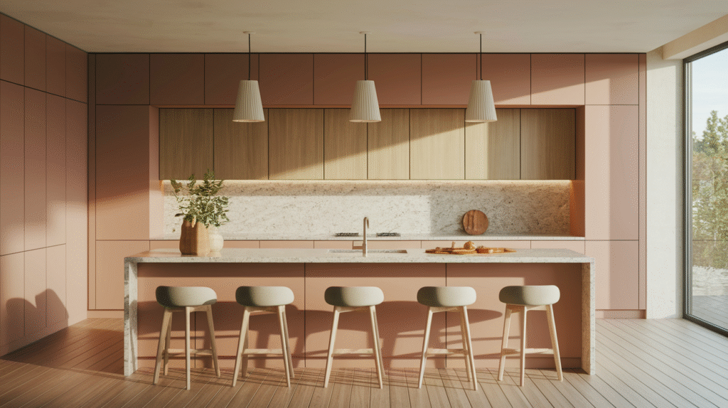
Clay & Soft Neutrals
Clay tones—those gorgeous terracotta-inspired hues that feel both ancient and completely current—bring a soulful, grounded energy to kitchens. These colors work beautifully on walls, creating a warm backdrop for lighter cabinetry, or on cabinets themselves for a bolder statement.
Pair clay with pale woods like light ash or whitewashed oak and layer in natural textures through linen window treatments, woven baskets, and stone or concrete surfaces. The result is a kitchen that feels cozy and inviting without being overly rustic or farmhouse-y.
This combination particularly appeals to anyone drawn to Mediterranean, Southwestern, or California-casual design aesthetics. It’s warm without being overpowering, colorful without being loud, and creates an atmosphere that makes people want to linger over morning coffee or evening wine.
Amazing Green Kitchen Color Schemes That Feel Fresh
Green is the undisputed champion of kitchen colors for 2026. But we’re not talking about the bright, primary greens of decades past. These are sophisticated, nuanced greens that range from barely-there sage to deep, moody forest tones.
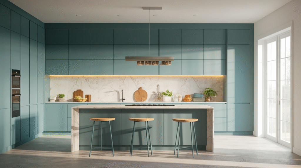
Gray-Green & Matte Brass
Gray-green is the number one designer pick for 2026, and once you see it in action, you’ll understand why. This color sits perfectly between green and gray, offering the calming, natural qualities of green without reading as overly botanical or traditional.
Sherwin-Williams’ Halcyon Green and similar shades in the gray-green family work beautifully on cabinetry, creating a sophisticated backdrop that pairs gorgeously with matte brass hardware and fixtures. The brass adds warmth and a touch of luxury without feeling too shiny or formal—it’s lived-in elegance at its finest.
This combination works in virtually any kitchen style, from sleek modern spaces to transitional designs that blend traditional and contemporary elements. Add white or cream countertops, and you’ve created a kitchen that feels current but won’t look dated in five years. The gray-green provides just enough color to feel intentional and designed while remaining neutral enough to work with changing accent colors and décor.
Sage & Pale Wood
Soft sage creates a nature-inspired kitchen that feels calm and restorative—exactly what you want in a space where you start and end your day. This muted green works particularly well in Scandinavian-inspired designs, where simplicity and natural materials take center stage.
Pair sage cabinets with light oak or maple wood tones for a look that’s both warm and fresh. The pale wood keeps things feeling light and prevents the green from becoming too heavy or dark. Add white or cream accents through countertops, backsplash, or even just dishware displayed on open shelves, and you’ve created a kitchen with serious staying power.
This combination particularly shines in smaller kitchens or spaces with limited natural light, where darker colors might feel claustrophobic. Sage brings personality and warmth without sacrificing the open, airy feeling that makes kitchens feel welcoming.
Deep Forest Green & White Marble
Ready to make a statement? Deep, jewel-toned greens create drama and sophistication in kitchens that can handle bold color. These rich hues—think emerald, hunter, or even navy-green hybrids—work beautifully when balanced with classic white marble countertops.
The contrast between dark green cabinetry and bright white marble creates visual interest and prevents the space from feeling too dark or moody. The natural veining in marble adds texture and movement, while the green provides a stunning backdrop that makes the white really pop.
This combination works best in kitchens with good natural light or strong artificial lighting that can showcase the depth and richness of the green. Consider using this palette on an island or lower cabinets if you’re not ready to commit to dark green throughout the entire space. Pair with brass or gold hardware for extra warmth, or go with polished nickel for a cooler, more contemporary feel.
Celery & Limestone Gray
Muted, foggy greens that lean almost gray create a contemporary minimalist kitchen that feels calm and collected. Sherwin-Williams’ Frosted Tints palette perfectly captures this aesthetic—colors that look like they caught morning fog, creating an ethereal, peaceful atmosphere.
Celery green, when muted enough to feel closer to limestone than lettuce, pairs beautifully with concrete-look finishes and stainless steel appliances. This combination appeals to anyone drawn to modern design with clean lines and minimal ornamentation.
The key to making this palette work is maintaining consistency in your undertones. Stick with cool-toned materials throughout—gray-veined quartz countertops, brushed nickel hardware, and matte gray backsplash tiles. The result is a sophisticated, cohesive kitchen that feels intentionally designed rather than thrown together.
Essential Blue & Purple Kitchen Color Combinations
Blue kitchens have been gaining momentum, and 2026 is the year they really take off. From deep navy to soft foggy blues, this color family offers incredible versatility and surprising warmth when paired correctly.
Inky Blue & Natural Wood
Deep, dark blue creates instant drama in kitchens, especially when contrasted with honey-toned wood. This combination works beautifully because the warmth of natural wood prevents the blue from feeling cold or unwelcoming.
Try navy or inky blue on lower cabinets or an island, then use natural wood for upper cabinets or open shelving. The contrast creates visual interest while maintaining balance—neither element overwhelms the other. This approach also has the practical benefit of hiding wear and tear on lower cabinets, which typically see more use than uppers.
If you’re feeling bold, go all-in with blue throughout the entire kitchen. This works particularly well in larger spaces with plenty of natural light. Balance the dark cabinetry with light countertops in white marble, quartzite, or even butcher block, and add brass or copper hardware for warmth.
The beauty of this combination is its versatility. It works in traditional kitchens with shaker-style cabinets, contemporary spaces with flat-panel doors, and everything in between.
Modern Lavender & Soft Gray
Purple in the kitchen might sound risky, but modern lavender is surprisingly sophisticated and completely livable. This isn’t the bright, childish purple of toy boxes—we’re talking about muted, dusty lavender that reads almost as a neutral.
The key to keeping lavender sophisticated is pairing it with the right complementary colors. Soft gray countertops ground the purple and prevent it from feeling too sweet or feminine. Chrome or brushed nickel fixtures add coolness that balances the warmth in lavender’s undertones.
This combination works beautifully in kitchens with good natural light, where the lavender can show its true color rather than reading as flat gray. Consider using lavender on an island or lower cabinets if you’re not ready to commit to it throughout the entire space. Pair with white or light gray upper cabinets for a balanced, approachable look.
Martha Stewart’s collection includes several gray-greens and softened tones that pair beautifully with lavender accents, creating a cohesive color story that feels both current and timeless.
Foggy Blue & Creamy White
Morning-mist blues create serene, spacious-feeling kitchens that work particularly well in smaller spaces. These soft, muted blues have enough gray in them to feel neutral while still providing color and personality.
Pair foggy blue cabinets with creamy white countertops and backsplash for a combination that feels fresh and clean without the coldness of stark white. This palette creates visual breathing room, making even compact kitchens feel more open and airy.
The beauty of this combination is its flexibility. Add natural wood tones through floating shelves, bar stools, or cutting boards for warmth. Incorporate brass or gold hardware for a touch of luxury, or stick with chrome for a more traditional, clean-lined look.
This color scheme particularly appeals to coastal, transitional, and soft contemporary design styles. It’s calming without being boring, colorful without being overwhelming, and creates a kitchen that feels like a peaceful retreat from the rest of your busy life.
Slate Blue & Warm Brass
Mid-tone blues offer the perfect balance between light and dark, providing enough color to make a statement while remaining incredibly livable. Slate blue—that gorgeous blue-gray that sits right in the middle of the value scale—creates a kitchen with serious personality.
The secret to making slate blue work is mixing cool and warm elements successfully. The blue itself is cool-toned, so balance it with warm brass hardware, fixtures, and lighting. The brass adds richness and prevents the space from feeling too cold or sterile.
Add texture through your backsplash choice—subway tiles with dark grout, zellige tiles with their handmade irregularities, or even natural stone with visible variation. These textural elements add depth and interest, preventing the space from feeling flat or one-dimensional.
This combination works beautifully in both traditional and contemporary kitchens. In traditional spaces, pair it with shaker-style cabinets and classic marble countertops. In contemporary kitchens, use flat-panel cabinets and sleek quartz surfaces for a more modern interpretation.
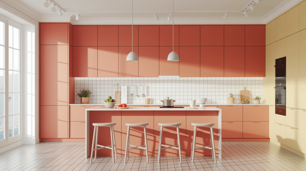
Quick & Easy Accent Color Combinations to Transform Your Kitchen
Not ready to commit to colorful cabinetry? These accent color strategies let you dip your toes into the color pool without diving in headfirst. Small changes can create surprisingly big impacts.
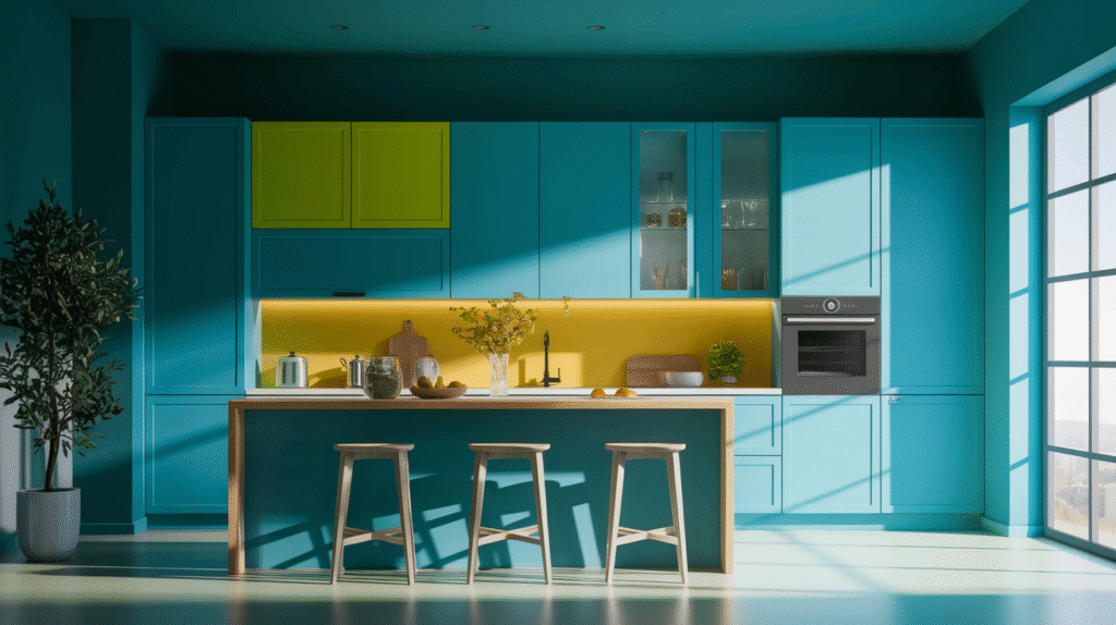
Lemon Chiffon Accents with Neutral Base
Soft yellow brings unexpected sunshine to neutral kitchens without overwhelming the space. Lemon chiffon—a muted, creamy yellow rather than bright primary yellow—works beautifully as an accent color in kitchens dominated by soft neutrals like Universal Khaki or Creamy white.
The perfect spots for this pop of color? A nature-inspired backsplash with botanical patterns, open shelving painted in this cheerful hue, or even small appliances like a stand mixer or toaster. These touches of yellow create visual interest and personality without requiring major renovation or commitment.
This approach works particularly well if you like to change your kitchen’s look seasonally or if you’re renting and can’t make permanent changes. Paint is inexpensive and easily changed, and small appliances can be swapped out when you’re ready for something new.
The lemon chiffon accent strategy creates a kitchen that feels happy and welcoming—the kind of space that lifts your mood every time you walk in.
Cordovan & Griffin Earth Tones
Bringing outdoor colors inside creates organic flow and connection to nature. Earthy shades like Cordovan (a rich, reddish-brown) and Griffin (a sophisticated gray-brown) work beautifully as accent colors in kitchens, especially when used in tile, accent walls, or decorative elements.
Consider a Cordovan-colored accent wall behind open shelving, or use these earth tones in your backsplash tile choice. Terracotta or cement tiles in these colors add texture and warmth while creating a focal point that draws the eye.
This color strategy works particularly well in homes where the kitchen opens to outdoor spaces. The earthy tones blur the lines between indoor and outdoor, creating visual continuity that makes both spaces feel larger and more connected.
Pair these accent colors with natural wood tones, stone surfaces, and plenty of plants to reinforce the nature-inspired aesthetic. The result is a kitchen that feels grounded, organic, and completely unique to you.
Two-Tone Cabinet Combinations
Two-tone cabinets remain one of the most effective ways to add color and visual interest to kitchens. The strategy is simple: use one color on upper cabinets and a different color on lowers, or paint your island a contrasting color from the perimeter cabinets.
The key to successful two-tone cabinets is choosing colors with similar undertones. If your upper cabinets are a warm white, choose a warm-toned color for lowers—think sage green, warm gray, or soft blue rather than cool, stark colors that’ll clash.
Light upper cabinets with darker lower cabinets is the most popular and practical approach. This combination keeps the kitchen feeling open and airy while adding depth and grounding the space. The darker lower cabinets also have the practical benefit of hiding wear and tear better than light colors.
Popular combinations include white uppers with navy lowers, cream uppers with sage lowers, or light gray uppers with charcoal lowers. Each creates a different mood and works with different design styles, so choose based on your personal aesthetic and the overall style of your home.
Hardware & Fixture Color Coordination
Never underestimate the power of hardware and fixtures to tie color combinations together. The finish you choose—matte brass, brushed gold, oil-rubbed bronze, polished nickel, or matte black—can completely change how your color palette reads.
Matte brass and brushed gold are the trending finishes for 2026, and they work beautifully with virtually every color combination I’ve mentioned. These warm metal finishes add richness and a touch of luxury without feeling too shiny or formal. They pair particularly well with green, blue, and warm neutral cabinetry.
The beauty of hardware updates is that they’re relatively inexpensive and easy to change. Swapping out cabinet pulls, drawer handles, faucets, and light fixtures can transform your kitchen’s look without major renovation. It’s one of the highest-impact, lowest-cost updates you can make.
When choosing hardware finishes, maintain consistency throughout the kitchen. Mixing metals can work, but it requires a confident eye and careful planning. For most kitchens, sticking with one metal finish creates a more cohesive, polished look.
Conclusion
The biggest color trends for 2026 center around warmth, soul, and atmospheric depth. Warm neutrals like mushroom and tobacco brown, sophisticated greens from sage to forest, and calming blues from foggy to inky are dominating designer portfolios and inspiring homeowners to embrace color in new ways.
The key takeaway? Choose colors that add warmth and personality while staying timeless. Avoid trendy colors that’ll look dated quickly, and instead focus on sophisticated, nuanced hues that’ll age gracefully with your home.
Start small with one combination that speaks to you. Maybe it’s painting your island a rich forest green while keeping perimeter cabinets neutral. Perhaps it’s swapping out hardware for warm brass and adding a sage-colored backsplash. Even these simple changes can completely transform how your kitchen feels.
Remember, the perfect kitchen color combination isn’t about following rules or replicating someone else’s design. It’s about creating a space that makes you smile every morning when you pour your first cup of coffee. It’s about colors that feel like home—warm, welcoming, and completely you.
Your kitchen works hard for you every single day. It deserves to be beautiful, inspiring, and full of personality. These 27 color combinations give you a starting point, but the final design should reflect your unique style and how you actually live in your space.
Ready to transform your kitchen with color? Pin your favorite combinations from this guide and start planning your kitchen refresh today. Whether you’re tackling a full renovation or just updating a few elements, the right color choices will breathe new life into your hardest-working room. Your dream kitchen is just a few color decisions away.